My Map
View Natural Reserves in Lebanon in a larger map
My map shows the natural reserves in Lebanon which are only a few. I chose to do this map because some people, including myself are unaware of some reserves. Also, these reserves are where most green vegetation can be found while most other plants and trees have been cut down due to urbanization.
Neogeography, according to class lecture, is new geography but has been around since 1922 but today involves the internet and GIS. Unlike standard maps that we find today, such as maps produced by USGS, neogeography are maps made at the person's discretion and on their own terms. Neogeography leads to a positive and negative effect. The positive aspect is that a person is able to express themselves in a map and show what is important to them. As a new map is created, it can be shared with others and the person's process of thinking and knowledge of space are also shared. In addition, it doesn't require a lot of experience and more importantly, it's user-friendly. Finally, it allows a person to be creative.
On the other hand, neogeography maps may mislead a viewer of such a map since they some locations may not be accurate. Also, a viewer may easily misconstrue a map when they are accustomed to standard maps. Similar to Wikipedia, there is no one checking for accuracy before I make a map public to the internet. Also, some neogeography maps may show points closer than they actually are and vice versa which may confuse the viewer and navigation. Although neogeography is user-friendly, people who are new to creating maps are more likely to make mistakes than those who have done a couple maps. Finally, creativity doesn't always go hand in hand with accuracy.
Sunday, October 21, 2012
Sunday, October 14, 2012
Week 2 Assignment - Dalal
1. The name of the quadrangle is Beverly Hills.
2. The names of the adjacent quadrangles are: Canoga Park, Van Nuys, Burbank, Topanga, Hollywood, Venice, Inglewood.
3. The first quadrangle was first created in 1966.
4. The datum used to create this map were the North American Datum of 1988.
5. The scale of the map is 1:24,000.
6. a) 5cm on the map is equivalent to 1200m on the ground.
b) 5in on the map is equivalent to 1.89mi on the ground.
c) 1mi on the ground is equivalent to 2.64in on the map.
d) 3km on the ground is equivalent to 12.5cm on the map.
7. The contour interval on the map is 20ft.
8. a) Public Affairs Building: 34.07419 N, -118.43933 W; 34º4’27” N, -118º26’21”W
b) The tip of Santa Monica Pier: 34.00753 N, -118.49995W; 34º0’27”N, -118º29’59”W
c) The Upper Franklin Canyon Reservoir: 34.12039 N, -118.41034W; 34º7’13” N
9. a) Greystone Mansion: 560ft, 170.68M
b) Woodlawn Cemetery: 160ft, 48.76M
c) Crestwood Hills Park: 634ft. = 193m
10. The UTM zone of the map is Zone 11.
11. The UTM coordinates for the lower left corner of the map are 3,763,000 Northings and 362, 000 Eastings.
12. The number of square meters contained within each cell of the UTM gridlines are 1,000,000m².
13.

14. The magnetic declination of the map is 14°.
15. In the intermittent stream between the 405 freeway and Stone Canyon Reservoir, water flows from north to south.
16.

2. The names of the adjacent quadrangles are: Canoga Park, Van Nuys, Burbank, Topanga, Hollywood, Venice, Inglewood.
3. The first quadrangle was first created in 1966.
4. The datum used to create this map were the North American Datum of 1988.
5. The scale of the map is 1:24,000.
6. a) 5cm on the map is equivalent to 1200m on the ground.
b) 5in on the map is equivalent to 1.89mi on the ground.
c) 1mi on the ground is equivalent to 2.64in on the map.
d) 3km on the ground is equivalent to 12.5cm on the map.
7. The contour interval on the map is 20ft.
8. a) Public Affairs Building: 34.07419 N, -118.43933 W; 34º4’27” N, -118º26’21”W
b) The tip of Santa Monica Pier: 34.00753 N, -118.49995W; 34º0’27”N, -118º29’59”W
c) The Upper Franklin Canyon Reservoir: 34.12039 N, -118.41034W; 34º7’13” N
9. a) Greystone Mansion: 560ft, 170.68M
b) Woodlawn Cemetery: 160ft, 48.76M
c) Crestwood Hills Park: 634ft. = 193m
10. The UTM zone of the map is Zone 11.
11. The UTM coordinates for the lower left corner of the map are 3,763,000 Northings and 362, 000 Eastings.
12. The number of square meters contained within each cell of the UTM gridlines are 1,000,000m².
13.
15. In the intermittent stream between the 405 freeway and Stone Canyon Reservoir, water flows from north to south.
16.

Tuesday, October 2, 2012
Week 1 Assignment - Interesting Maps - Dalal Chamas
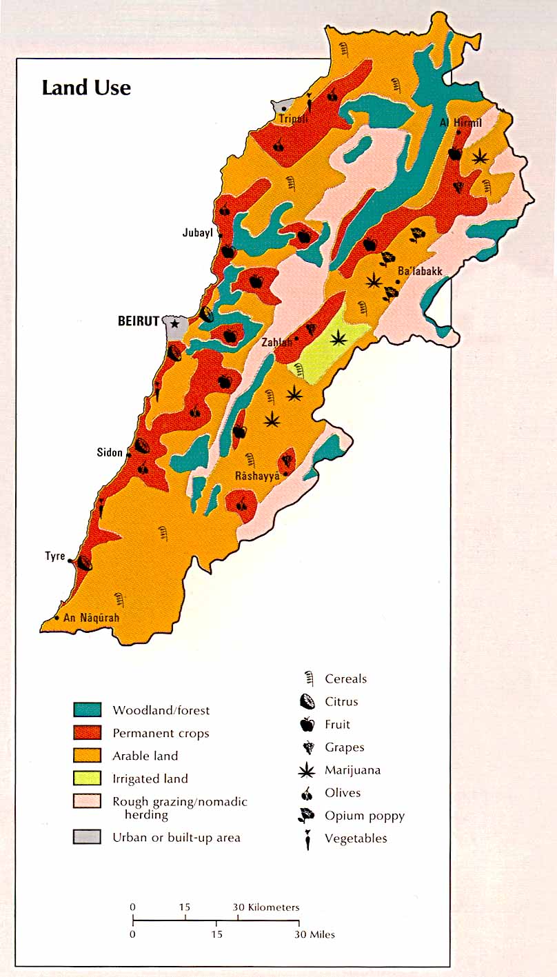 |
| Land Use. 1993. Photograph. Leb Guide, Beirut. Web. 2 Oct 2012. <http://www.lebguide.com/lebanon/images/maps/lebanon_land.jpg>. |
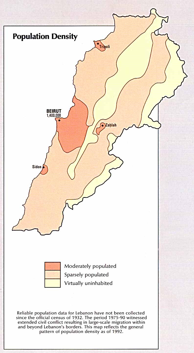 |
| Population Density. 1993. Map. Leb Guide, Beirut. Web. 2 Oct 2012. <http://www.lebguide.com/lebanon/images/maps/lebanon_pop.jpg>. |
 | |||||
| Map of Los Angeles. 2004. Photograph. Golden Horizon Travel, San Francisco. Web. 2 Oct 2012. <http://www.goldenhorizontravel.com/photos/california-tour-map.gif>. |
Subscribe to:
Comments (Atom)