Thursday, December 13, 2012

Week 9 Assignment - Dalal

Reference
Thematic
Within the context of the two maps I have presented, The Station Fire seems to burn so widely and for so long. Indeed, this fire was one of the largest fires in modern times (dailynews.com, 11-24-09)  for Los Angeles County and carved out a significant amount of the heart of the county. On August 26, 2009, a fire began in southern California near Highway 2, north of La Canada-Flintridge. It spread through the Angeles National Forest, threatening many homes in the surrounding cities. Five days after it began, the Station Fire was only 5% contained. 

Southern California is an area at high risk for fires.  The geography in Los Angeles County contributes to this risk.  There have been many large fires that put the city and its residents in great danger.  One of the leading contributors to these large fires is drought .  Eight very large fires, about 150,000 acres in size, have occurred in California since the 19th century.  Each of these fires was preceded with an extremely long drought anywhere from one to four years long (“Large Fires Natural…”).  In the article, the governor of California on November 30, 2009 it was stated, “The precipitation in Water Year 2009 was the third consecutive below average year for the state” (CNN).  The Station Fire of 2009 was greatly affected by the condition that the state of California was in at the time.  Being a drought year that year immensely affected the fire in Los Angeles County.

In the first map titled, Elevation in Angeles National Forest and Station Fire, I used the Station Fire perimeter provided by the Los Angeles County website. The website was very helpful since it provided me with how fast the fire spread and the areas it covered with the legend providing the date and hour. It also provided me the location of the Angeles National Forest in regards to the Santa Monica Mountains. I also used Arc Toolbox in order to create hillshade which is also elevation. I was able to create the hillshade with the DEM that was given for the lab. I was lucky in that the shapefile that I found used the same, common datum, of  GCS North American 1984. The map is a reference map and shows that the Station Fire took place in the Angeles National Forest which found in higher elevations and the forest is made up of mountains. Also the map shows that the fire burned a large area over just a few days and it took time to contain the massive fire.

In the second map titled, Station Fire and Airport Locations, I used the Station Fire perimeter provided by the Los Angeles County website. The website was very helpful since it provided me the areas the fire covered and the location of the Angeles National Forest. I also used the UCLA's Spatial Data Repository which provided me with several options and that is where is got the airport location shapefile. Fortunately, the shapefiles that I found used the same datum as mentioned above. I was also able to get an understanding of the location of the Station Fire in regards to how close it is to surrounding cities. I also measured the distance of the surrounding airports in order to know how fire fighting water planes travel with the measuring tool found in the toolbar. The distance from Whiteman Airport to the fire was 15.1 miles, the distance from Van Nuys Airport was 19.86 miles, the distance from Burbank Airport was 14 miles, the distance from El Monte Airport was 19.1 miles, the distance from Brackett Field Airport was 27.35, and finally the distance from LAX was 36.43. The map is a thematic map and shows that the closest airports to the fire are Whiteman Airport, Van Nuys Airport, and Burbank Airport. It would be easier for fire fighters to use the closer airports in order to refuel and get to the fire in a shorter time. The legend also shows the airports as red polygons as well as the the date and hour of the fire.     

The Station Fire of 2009 was a very large fire that impacted many cities and therefore people.  It burned a huge area of land.  The tool of GIS is so helpful in situations such as natural disaster because they can be used to outline the affected areas and studied to see the impacts that the fire will have on surrounding areas.  It is important information to know what cities, roads and hospitals will be affected, which is why I thought that would be important to display these landmarks on my map.  


Bibliography

“Station Fire report: Don’t take weapons out of the arsenal – LA Daily News.” Home – LA Daily News. 24 Nov. 2009. Web. 8 December 2012. <http://www.dailynews.com/opinions/ci_13859790>.

"Large Fires Natural and Inevitable in Southern California." The California Chaparral Institute. N.p., 4 Sept. 2009. Web. 8 December 2012.

"All Station Fire Perimeters." Los Angeles County Enterprise GIS. WordPress & Atahualpa, 2011. Web. 30 November 2012. <http://egis3.lacounty.gov/eGIS/?p=1055>.

"UCLA's Spatial Data Repository." Map Share. University of California Los Angeles, 18 Feb. 2009. Web. 26 May 2011. <http://gis.ats.ucla.edu/Mapshare/>.

“Angry fire’ roars across 100,000 California acres.” <http://articles.cnn.com/2009-08-31/us/california.wildfires_1_mike-dietrich-firefighters-safety-incident-commander?_s=PM:US>. CNN, 31 Aug.2009. Web. 8 December 2012.

Sunday, November 25, 2012

Week 8 Assignment

In the "Difference, 1990 to 2000" map, I noticed that population change occurred the most in the bigger cities such as Los Angeles and New York. There was negative population change mostly in the north west and some counties in almost every state. I noticed that the scale of population change provided by the Census may be confusing to some while reading the map and would need further explanation. I also believe that the color ramp makes the map easy to navigate and the colors aren't too close to each other. 

In the "Number of People, 2000" map,  I noticed that the number of people was greater in metropolitan cities. For example, Los Angeles county had a higher number of people compared to other counties in Nevada. The scale is more helpful than the scale for the "Difference, 1990 to 2000" map in that there are no negatives. I noticed that the color ramp may confuse some people in that some colors are close to one another.
 
In the "Percent Change, 1990 to 2000 Total Population" map, I noticed that there was a high percentage change in some Nevada counties. There were some negative percentage change in some counties in Texas as well. The scale is helpful, however the color ramp isn't helpful. The color ramp makes it difficult to decipher the two dark shades from one another, they both look black. Other than the two dark colors, everything else makes the maps easy to read.


In the "Population Density, 2000" map, I noticed that Los Angeles county has a dense population as well as other metropolitan cities. Some counties in Texas and Nevada had a low population density as well. I also noticed that the scale and color ramps were helpful. However, if someone is looking at the map from a distance, then they may have trouble telling the difference between the lighter green and white.

Working on the Census map series tutorial was slightly more difficult than the previous tutorial that we worked on in that the instructions weren't too clear. For example we were asked to sort the table, however it couldn't be done because the related rankings and columns wouldn't match when sorted. Another issue was the mismatched tables, if the error wasn't written in the instruction sheet, it would have made the map incorrect. Working with GIS has become easier than before due to practice and I'm getting more used to it. Also I'm realizing how much can be done with GIS and how easy it is to create a map with correct data.


Monday, November 19, 2012

Week 7 Assingment - Dalal


The following DEMs are of aspect, slope, hillshade, as well as a 3d image of the location. DEM of the 3d image is from "ned_03854530". The datum, geographic coordinate system used is GCS North American 1983 and the extent is 39.8° top and 39.38° bottom. The extent from the left is -105.79° and from the right is -104.97°.

Monday, November 12, 2012

Week 5 Assignment - Dalal

Equidistant Projection measurements from Washington, D.C. to Kabul:
  • Sinusodial Projection: Geodesic = 6,930.97 mi., Loxodrome = 8,088.14 mi., Great Elliptic = 6,909.31 mi.
  • Equidistant Conic Projection: Geodesic = 6,976.59 mi., Loxodrome = 8,112.06 mi., Great Elliptic = 6,915.06 mi.


Equal Projection measurements from Washington, D.C. to Kabul:
  • Bonne Projection: Geodesic = 6,918.66 mi., Loxodrome = 8,112.06 mi., Great Elliptic = 6,915.06 mi.
  • Cylindrical Equal Area Projection: Geodesic = 6,994.40 mi., Loxodrome = 8,112.06 mi., Great Elliptic = 6,930.98 mi.


Conformal Projection measurements from Washington, D.C. to Kabul:

  • GCS WGS 1984 Projection: Planar = 10,106 mi.
  • Mercator Projection: Planar = 7,110 mi.
In this week's assignment, we produced different map projections based on the data that was given to us as well as the data that we added. We made Washington, D.C. and Kabul stand out with blue markers and then measured the distances between the two with each projection. Measuring was a little difficult than it seemed because every time I measure the same projection, I received different measurements. The measurements weren't drastically different but they were a couple numbers off. This made me realized that it can be difficult to receive precise measurements. I even compared my measurements for the conformal projections with my neighbor and noticed that our measurements were a little different. Having different measurements may raise alarm, unless I wasn't doing it properly. It also made me think of the perils of map projections and their significance since measurements vary.

As mentioned in class lecture, map projections vary and the distance between two points on each projection is rarely the same. Also in order to work with map projections and layering on ArcGIS, we have to make sure that spatial attributes on the layers are all the same for the shapefiles. If the spatial attributes aren't the same, then the layers and measurements will be completely off. For those who are new to ArcGIS, like myself and others, it can easily be brushed over unless we are taught to double check the spatial attributes, such as this assignment. Not double checking the spatial attributes or knowing that you need to match them up can cause problems and is a peril of map projections. In all of my map projections above, I made sure to double check my spatial attributes when working on the maps.

The significance of the various map projections is the different purposes they have and points they want to make. Each map projection has different story to tell as well as point of view. Some projections center their maps according to the country it is produced from while others make their own country look bigger than others when in reality it is the opposite. For example, in the Mercator projection under the conformal projections, Alaska looks bigger than Brazil when that's not the case. Making a country look bigger and in the center of a projection makes that country look more "powerful".

The potentials of map projections are to show the different points of views based on the producers of the projections. Also, the various projections allow for various purposes as well as specific purposes. For example, some map projections show the shortest distances from one location to another if the projection is accurate. Overall, map projections can be helpful to map users, however, the user has to be weary of the projection and fully understand various projections.  


Monday, November 5, 2012

Week 4 Assignment - Dalal

This week was the first time using ArcMap through a lengthy tutorial. I was unaware of various aspects of ArcGIS and didn't know there was such a thing as ArcGIS. The level of intimidation got to everyone and there seemed to be a rush of getting it done quickly which was impossible. I had some trouble with the ArcMap tutorial, but overall it was a positive experience. However, I found it to be a little long and tedious due to how long it took to complete this lab. I did find some buttons and functions to be a little confusing since there are other similar buttons found on the different tool bars. However, with the thorough directions, I was able to figure out the similar buttons.

ArcGIS is an important tool and used in all fields whether it be entertainment or engineering according to class lecture. Through ArcGIS, you are able to efficiently model specific data sets according to class lecture. It can be used to create maps and show points of interests at various levels based on the data that is given about that point. ArcGIS is almost always used for development, as well as preservation in order to figure out whether an area can be used for development, as well as other factors with data layering and design. This is effectively done with correct and proper data in order to produce the most accurate ArcMap. 

The pitfalls of ArcGIS is that if the data isn't accurate, then the map produced will be incorrect. Also working with ArcGIS is tricky to work with and it works best with someone who is very computer savvy/literate. Also you need a lot of experience in ArcGIS in order to be comfortable and understand everything you need to do and how to do it. ArcGIS isn't available to everyone since it needs to be purchased, especially the most used made by ESRI. However, there are other companies which vary based one the information you put in and what kind of output you want to receive according to class lecture.

Overall, ArcGIS has its peaks and pitfalls and it mostly depends on experience and availability. It has a lot of potential and advantages and an important tool used in almost all fields. All new technology has its peaks and pitfalls, but it depends on the perspective of each person.
My ArcMap

Sunday, October 21, 2012

Lab 3: Neogeography - Dalal

My Map


View Natural Reserves in Lebanon in a larger map

My map shows the natural reserves in Lebanon which are only a few. I chose to do this map because some people, including myself are unaware of some reserves. Also, these reserves are where most green vegetation can be found while most other plants and trees have been cut down due to urbanization. 

Neogeography, according to class lecture, is new geography but has been around since 1922 but today involves the internet and GIS. Unlike standard maps that we find today, such as maps produced by USGS, neogeography are maps made at the person's discretion and on their own terms. Neogeography leads to a positive and negative effect. The positive aspect is that a person is able to express themselves in a map and show what is important to them. As a new map is created, it can be shared with others and the person's process of thinking and knowledge of space are also shared. In addition, it doesn't require a lot of experience and more importantly, it's user-friendly. Finally, it allows a person to be creative.


On the other hand, neogeography maps may mislead a viewer of such a map since they some locations may not be accurate. Also, a viewer may easily misconstrue a map when they are accustomed to standard maps. Similar to Wikipedia, there is no one checking for accuracy before I make a map public to the internet. Also, some neogeography maps may show points closer than they actually are and vice versa which may confuse the viewer and navigation. Although neogeography is user-friendly, people who are new to creating maps are more likely to make mistakes than those who have done a couple maps. Finally, creativity doesn't always go hand in hand with accuracy.

Sunday, October 14, 2012

Week 2 Assignment - Dalal

1. The name of the quadrangle is Beverly Hills.

2. The names of the adjacent quadrangles are: Canoga Park, Van Nuys, Burbank, Topanga, Hollywood, Venice, Inglewood.

3. The first quadrangle was first created in 1966.

4. The datum used to create this map were the North American Datum of 1988.

5. The scale of the map is 1:24,000.

6. a) 5cm on the map is equivalent to 1200m on the ground.
    b) 5in on the map is equivalent to 1.89mi on the ground.
    c) 1mi on the ground is equivalent to 2.64in on the map.
    d) 3km on the ground is equivalent to 12.5cm on the map.

7. The contour interval on the map is 20ft.

8. a) Public Affairs Building: 34.07419 N, -118.43933 W; 34º4’27” N, -118º26’21”W
    b) The tip of Santa Monica Pier: 34.00753 N, -118.49995W; 34º0’27”N, -118º29’59”W
    c) The Upper Franklin Canyon Reservoir: 34.12039 N, -118.41034W; 34º7’13” N

9. a) Greystone Mansion: 560ft, 170.68M
    b) Woodlawn Cemetery: 160ft, 48.76M
    c) Crestwood Hills Park: 634ft. = 193m

10. The UTM zone of the map is Zone 11.

11. The UTM coordinates for the lower left corner of the map are 3,763,000 Northings and 362, 000 Eastings.

12. The number of square meters contained within each cell of the UTM gridlines are 1,000,000m².

13.

14. The magnetic declination of the map is 14°.

15. In the intermittent stream between the 405 freeway and Stone Canyon Reservoir, water flows from north to south.

16.


Tuesday, October 2, 2012

Week 1 Assignment - Interesting Maps - Dalal Chamas

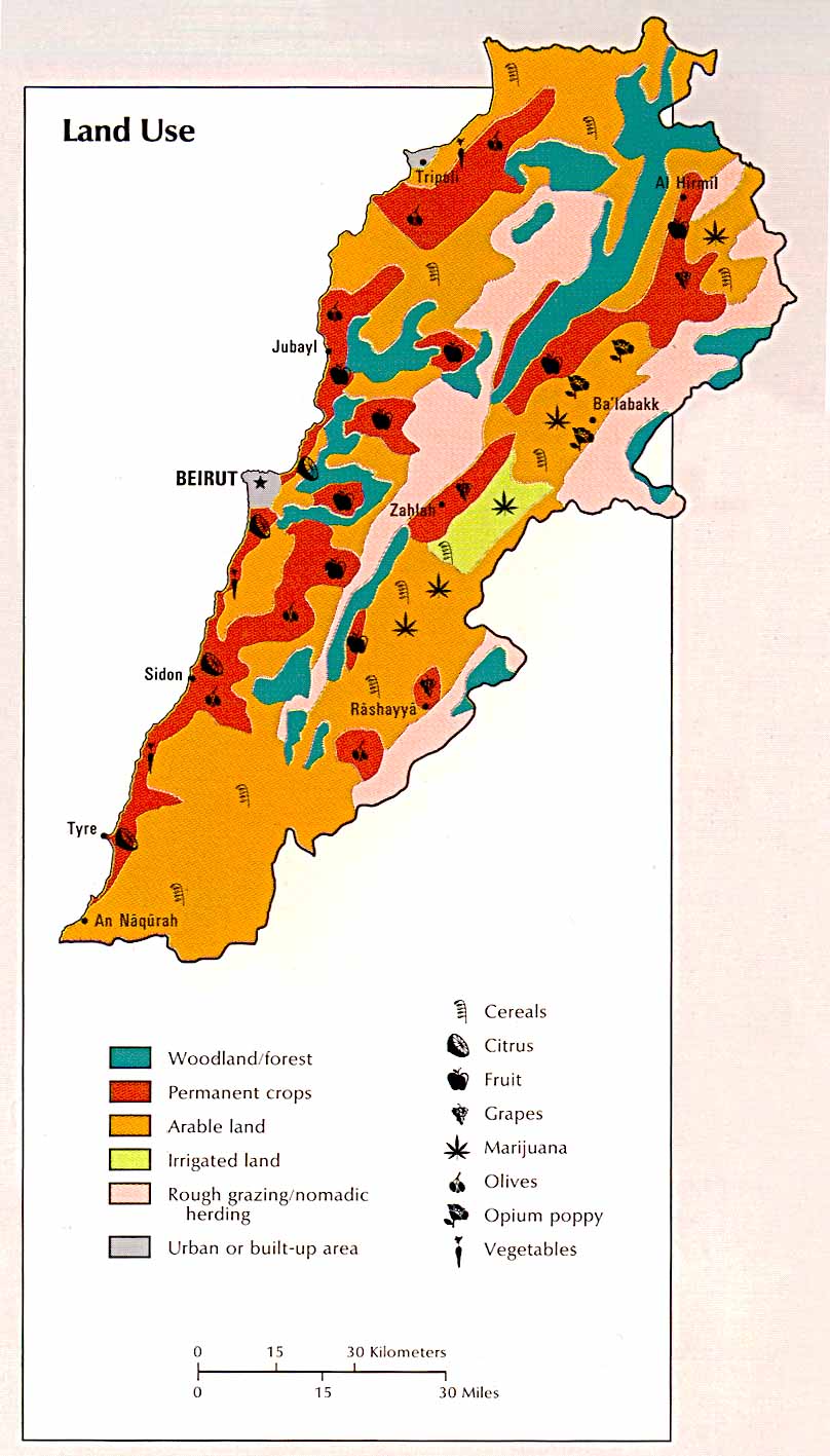
Land Use. 1993. Photograph. Leb Guide, Beirut. Web. 2 Oct 2012. <http://www.lebguide.com/lebanon/images/maps/lebanon_land.jpg>.
The first map I chose was of Lebanon's land use. I'm originally from Lebanon and I have seen pictures in the past of when my parents used to live there with trees and green everywhere. Unfortunately, most trees are found in sanctuaries which aren't funded and taken care as much as they should. The pollution is on the rise as well since many trees have been cut. I found this map on: http://www.lebguide.com and it was from the Atlas of the Middle East 1993. The map shows the land use in Lebanon and what stands out is the orange which is arable land. Also there is a small strip of irrigated land while the rest is land for permanent crops and some woodland/forest. I also liked that the map identified where certain crops tend to grow in relation to their region and geographic location. What I found interesting is the ratio of arable lands to woodland/forests which is the first thing that stood out to me when I first saw the map. The map was done in 1993 and unfortunately many more woodlands have been cut down due to construction and urbanization.

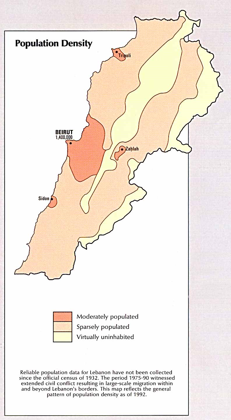
Population Density. 1993. Map. Leb Guide, Beirut. Web. 2 Oct 2012. <http://www.lebguide.com/lebanon/images/maps/lebanon_pop.jpg>.
The second map I chose, Population Density, was from the same website, http://www.lebguide.com, and it was from the Atlas of the Middle East 1993. I chose this map to compare and contrast the reasons why certain woodlands/forests were located where they were identified on the map. Also I wanted to see what was located around densely populated areas such as Beirut, the capital of Lebanon. Beirut is shown on the Land Use map as "urban/built-up", therefore the land is not used. In this map, Beirut and its surrounding neighborhoods are "moderately populated" with a population of 1.4 million. What I found interesting is three other smaller densely cities surrounding Beirut while Beirut remains the center. I also found interesting that the surrounding "moderately populated" cities still made use of their land unlike Beirut. For example, Sidon uses its land for growing citrus and olives and they are known for making olive oil which I was able to taste. In Zahlah, they use their land for growing grapes and are known for making wine and many winery's can be found. Overall, I was able to have a better understanding of the correlation between land use and population density in Lebanon.

Map of Los Angeles. 2004. Photograph. Golden Horizon Travel, San Francisco. Web. 2 Oct 2012. <http://www.goldenhorizontravel.com/photos/california-tour-map.gif>. 
 The last map I chose was of Los Angeles in where I was born and raised and I this map stood out to me when I was searching because of how animated it was. Although it's animated and created by a travel agency, it's distorted and makes all the attractions seem so close to one another. For example, a car ride from Los Angeles to Las Vegas takes about 5 hours. I think the travel agency achieved their goal of making all the attractions appealing but may upset some people when they realize how far everything is from one another. The map also shows all the nice things and attractions of California and Nevada with icons although the map is titled Map of Los Angeles. What I found interesting is how close the travel agency made the attractions seem to one another and how other attractions such as the Griffith Observatory or Huntington Beach Botanical Garden aren't located.